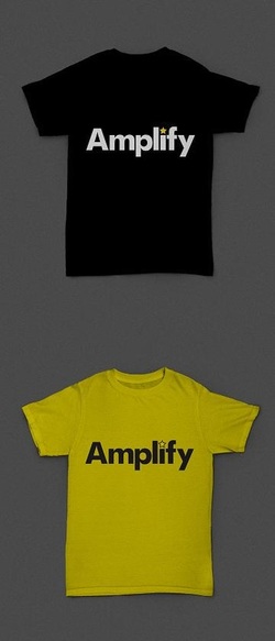
 Alongside the studio renovation, the branding of Amplify is starting to take shape. After brainstorming with a graphic designer, we agreed that Amplify's services are so diverse that simple is best in terms of branding.
We've chosen a vibrant colour scheme which has an energetic vibe. The bright yellow really makes me smile :) And the logo can be shortened to an A* star icon, making a positive statement about the result of hard work. So, the first batch of flyers have now been sent to print and sample tees are on order. I'm so excited to start spreading the word and enrol Amplify's first budding performers! But there's still a lot to do including the website and just one month until launch. I'm absolutely loving being rushed off my feet and turning my vision into reality.
0 Comments
Leave a Reply. |
AuthorLife behind the scenes with Amplify founder Jemma Bird. Archives
May 2020
Categories |
 RSS Feed